RITUEL DE FILLE - OUTCOMES
- Jun 4, 2018
- 3 min read
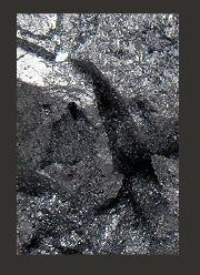
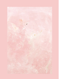
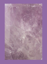
For my outcomes I wanted to produce a logo that still incorporated the Rituel De Fille logo so to tie in with the crystal fragrance collection I placed a line drawing of quartz behind. I decided to finalise my fragrance collection three crystal inspired scents; amethyst, hematite and rose quartz.

As the collection would feature three fragrances, I had the idea to create a trio of pop up shops open next to each other. The stores would all be in a cube shape and the exterior would look the same as the packaging for the bottle. I think having the packaging as the exterior of the store will create a sense of mystery as to what’s inside as the packaging itself is minimal. Inside the store the walls are decorated with the story of the crystal that the store represents. As you read the story and walk down towards the back wall you will find the fragrance along the sides (available to purchase) and a sales assistant there to list the benefits of the crystal and explain the fragrance further. Finally, on the back will sit a large crystal where consumers can chip away their own piece that can be added to a chain and sent to them as a necklace with each purchase; this feature would only be available at the pop-up store to attract more people and bring a sense of exclusivity.
The packaging for each fragrance will be in accordance with the crystal it is based on. The amethyst fragrance will have an all violet, smoky amethyst colour and feature its name in the Greek alphabet; αμέθυστος. The hematite fragrance will be a dark block montana grey colour with its name; αιματίτης. The rose quartz fragrance will be block pink and include its name; ροζ χαλαζίας. The simplicity of the outside of the packaging with just a colour and a name is to represent how with crystals there’s more than meets the eye. Inside the packaging will contain the bottle, a crystal and the story written on the inner lid.

Mock ups
I created a poster advertising the pop-up store in the style of the simple packaging. I wanted the poster to look like the heavens where the Ancient Greeks believed crystals were eternal ice falling from above. I then placed the logo at the top in the centre as if it were Zeus ruling the sky above the cloud and shooting lightning bolts down. I wanted the store to be in Covent Garden as the consumer for this product would be a female working woman in London passing through Covent Garden through her lunch break or having after work drinks. The location is also great for attracting new consumers and age ranges as Covent Garden is a great spot for shoppers and tourists.

Media diary
The consumer is information hungry so after seeing such a simple poster is likely to go on social media and look further. They are weary of major brands as they don’t see them as authentic so Rituel De Fille should appeal to them as they are a family run business. The consumer is likely to live in or around London or somewhere of that perimeter so will get the tube to work and walk past posters the whole way. I will stick my posters on walls in more urban areas of London and tube stops as this is where they are likely to interact. I could also send out fragrances to influencers and make up artists who will then review the collection on blogs as most millennial consumers check blogs before they purchase, and invite them to the pop-up shop launch party.


Comments